
In Redmine there is a lot of data, that is easier to read and understand if it can be seen otherwise.
Mostly graphs are here to allow comparison on different data sets within an entity. But often people want a quick answer to a more simple question like:
- On which days are most issues actually created?
- How much have I actually participated in the project and created new issues in the past months?
- How many issues of a certain type (e.g. support requests) have been received the past time?
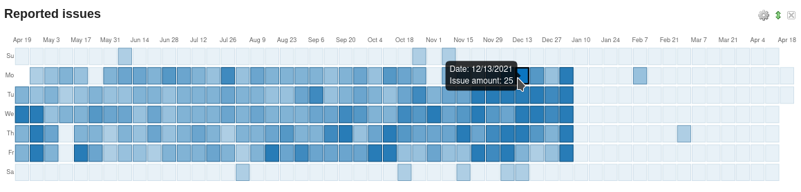
With the Reporting plugin version 3.0.6 a new chart has come, that makes it very clear where there is an increase in newly created issues the past year.
What does the graph do?
It converts the creation date of an issue into a graphical output in the form of a matrix visualisation. The lighter the color, the fewer issues were created on a day. The darker the color, the more issues were created at a day.
Y-axis: shows day of the week (monday to sunday) X-axis: displays the start date of the week
Note: This function is part of the upcoming (not yet released) plugin version 3.0.6
The diagram is based on the GitHub Contribution Graph. It is a kind of matrix graph that helps advanced users to analyse newly created issues.
It may not be immediately understandable to a traditional user. But that is not our goal either. We want to improve access to newly created issues that were created on a certain day. And we want to show that data in a different way in order to do further analysis if you are a project manager with responsibility for several projects or a decision maker.
In that case the matrix graph for Reported issues helps you for example to identify easily time areas with particular large amount of new added issues.
Use case examples
Identify periods with increased support volume
As the person in charge of the support team, you may want to find out if you receive more support requests than usual after the release of a new service or a product update.
The matrix visualization helps to uncover this circumstance. If the creation of support issues has increased shortly after the release, this indicates possible user problems or even an increased interest in the new product (depends on your focus).
Locate projects with less new issues
As a member of the executive team, you are responsible for deciding whether certain projects are still worth continuing.
The matrix visualization helps to determine how much activity there is in a project regarding the creation of new issues. The greater the time interval, the less important the project currently might be. Such projects can be archived and the remaining employees can be deployed elsewhere.
There are many possible applications for this type of evaluation. In addition to new issues, the graph is also provided for other entities like:
- new log entries,
- created spent time entries on issues,
- new DB entries (if DB plugin is installed),
- new Password entries (if Passwords plugin is installed),
- new users and attendances (if HRM plugin is installed).
If you hover over the diagram with the mouse pointer, you get additional information and are linked to the corresponding entries.
The colors of the graph depend on the color theme you have chosen in the plugin settings.
Access to the graphical evaluation do have users with appropriate permission. Which must be set accordingly in the administration area Roles & Permissions. Those who are allowed to create their own dashboard are also allowed to add an individual Reported issues graph of their own in their personal dashboard view. If custom queries exist you can add it as base for your data evaluation.
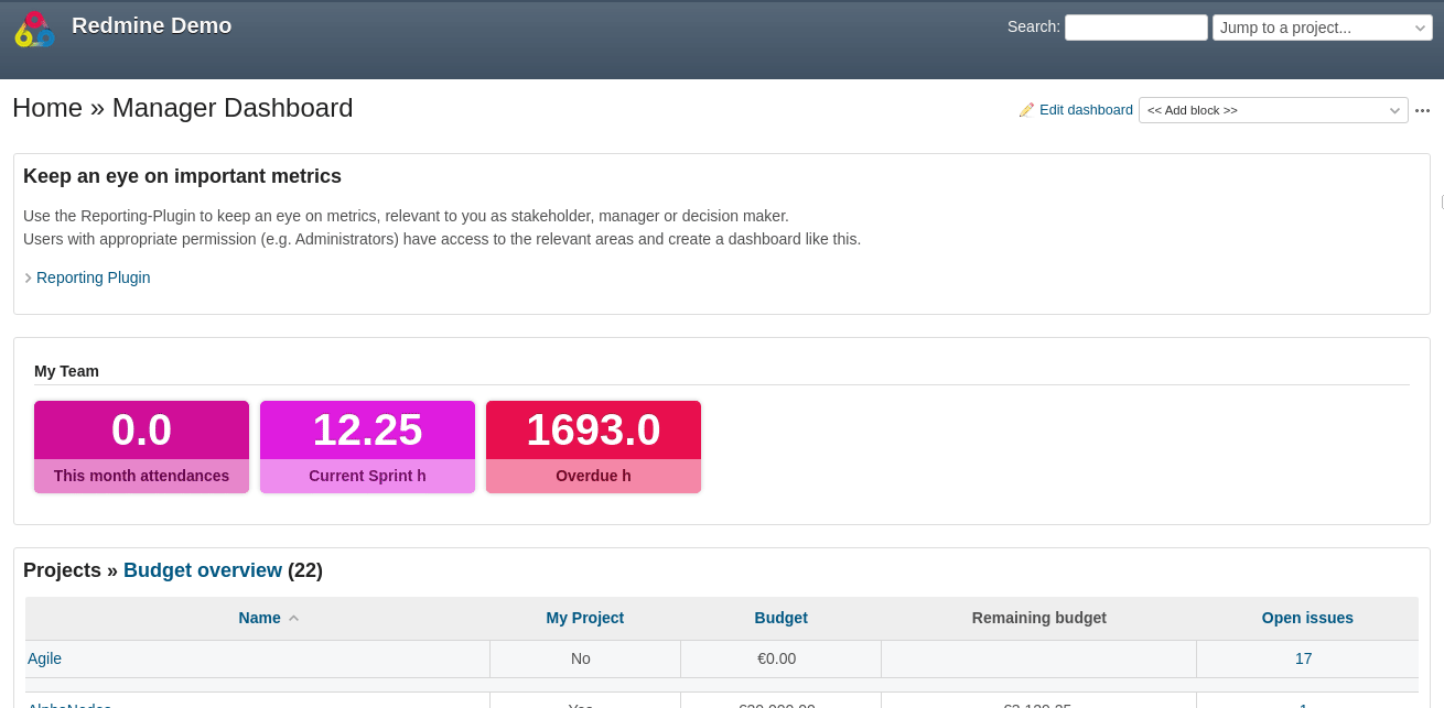
Redmine Reporting Plugin provides better insights
Instead of working with long, confusing issues lists, the Reporting Plugin supports you to convert important data into visual views and analysis. The Reported issues graph can be added to a dashboard block. You can even create individual custom queries here and pass their evaluation to the graph. Then you will only see the issues that are specifically relevant to you.
With the Reporting plugin in general we provide functions to not only solve individual customer problems, but try to generalise problem solving as far as possible. With the aim of encouraging a certain customer behaviour and thus positively influencing the business results in the longer term.
We hope to not only save the client time, when using our products, but to increase efficiency or even reduce costs.
The described function here is part of the plugin version 3.0.6. At least Redmine v5.x is required for this plugin version. Older plugin versions will not be supported anymore. Which mean you need to upgrade your Redmine system until then to v.5x.
Redmine - Open Source Project Management Software
Redmine is a free, web-based project management software that provides project teams of all kinds with extensive functions. In addition to user and project management, users have access to discussion forums, wikis and task management. Redmine is a good alternative to commercial applications. Because companies can scale more cost-effectively and are not tied to specific vendors or limited user licences. If you want to learn more about Redmine, you can find extensive information at “redmine.org”.